The brief:
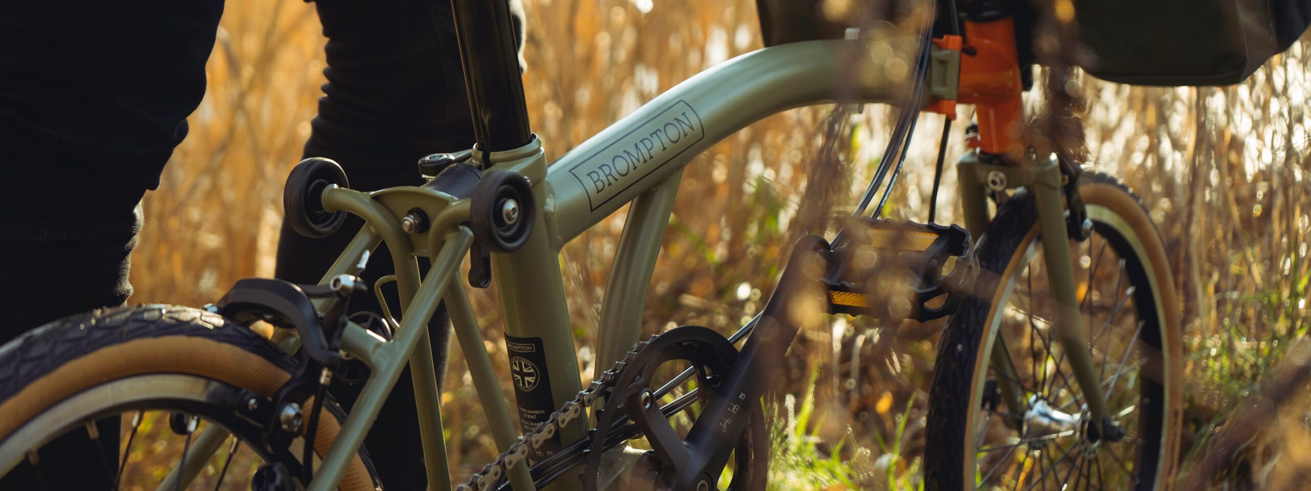
Brompton Explore was a special edition that celebrated the bike packing, touring and urban exploring communities. The bike featured a unique colour way, pairing matte khaki green with a blaze orange front frame.
Finishing trim was a special set of tan wall tyres, matching gum handlebar grips and Brooks C17 saddle, reduced chainring and a one-off luggage set.
The marque of the bike evolved over a few iterations and we wanted something that captured the sense of exploration and adventure but still felt modern. The final symbol was based on the location services icon found on smartphones, which is itself based on a compass.
To augment the branding, we used the tagline Take the long route, which was intended to capture the everyday adventure this bike was intended to inspire. Take the long route could just as much apply to your ride to work as it could a planned trip to the depths of the highlands.
The launch event was hosted at a FourPure Brewery in London (after a ride-out to the Thames Barrier with some attendees) and featured a film screening and talks with a panel of adventurers and athletes.
